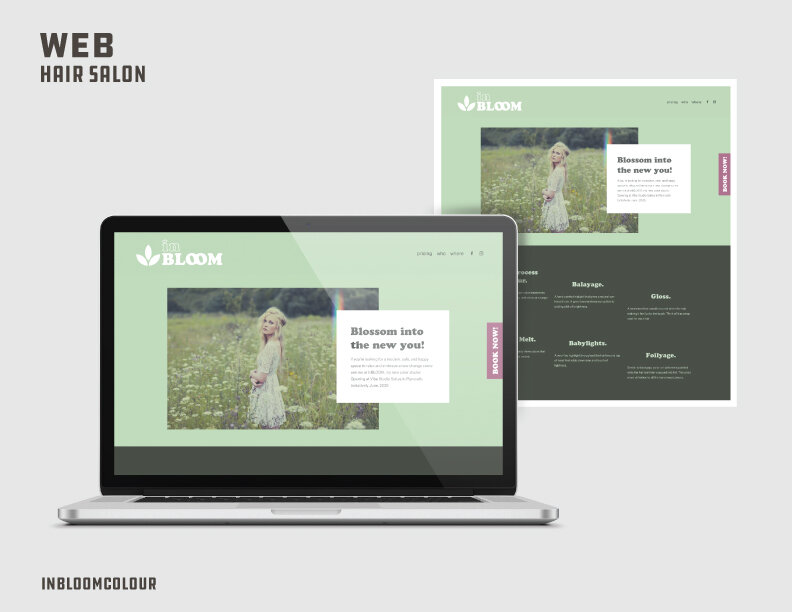
Designed out a single page website for Salon inBloom keeping UI and UX in mind. Created jump links in the menu system to direct customers to specific locations on the page. Added in CSS to create a vertical and fixed “Book Now” button.
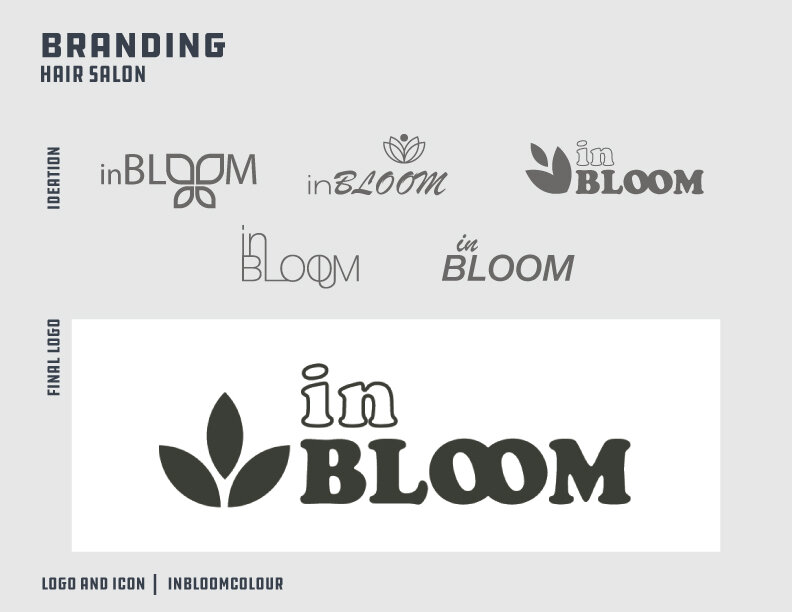
Created a logo and branding guidelines for inBloom Salon in Plymouth, MI. Developed ideas from sketch to final product. Delivered final files in the form of transparent PNG’s, .ai files, and .JPGs.
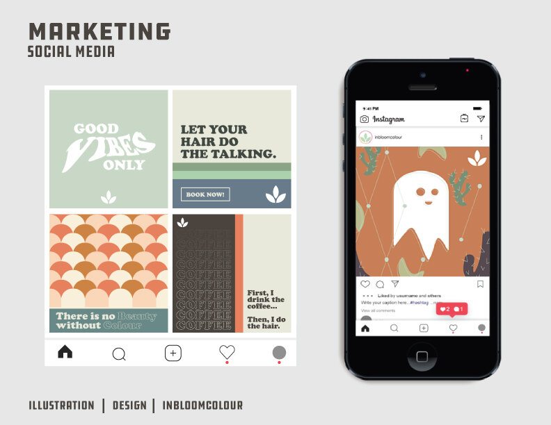
Developed a social media marketing campaign to launch and build a base for inBloom hair salon. Delivered an aesthetic that was relatable yet unique enough to draw attention. Followed industry standards to Instagram/Facebook social posts.

Created a full website for Dohenycompany.com. Using data from the previous website and implementing UX and UI standards, I increased the time customers spent on the site, decreased bounce rates by almost 20%, increased contacts and sales, and created a building block for future usage of the website. Well over 200 pages have been created for the website, integrations with email marketing and lists have been implemented. Custom CSS for anything from jump links, to e-commerce editing, to adjusting wordpress functions.
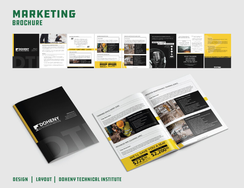
Created a saddle-stitch brochure for Doheny Technical Institute. Retouched all photos, executed layout with bleeds and trims, and built on previous iterations of branding to push DTI into a more modern and distinguished feel.
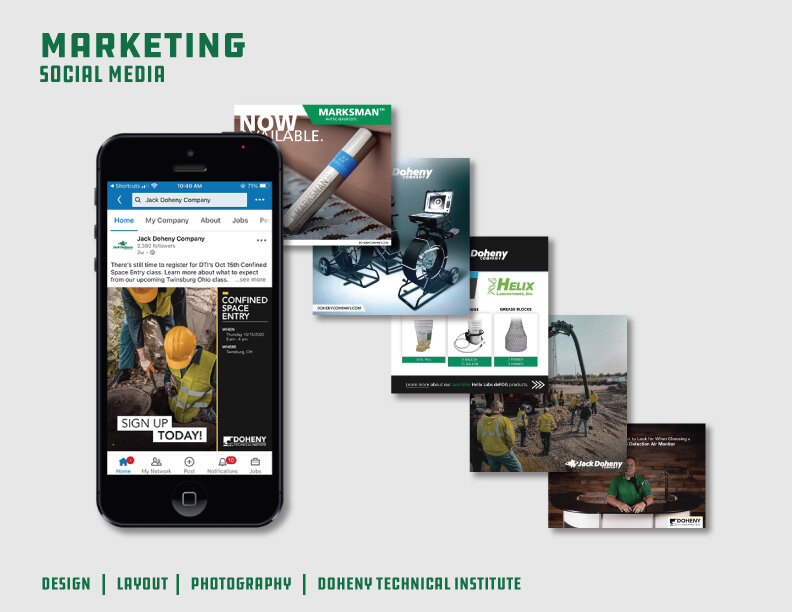
I have created over 100 images for social media (Facebook / LinkedIn) by retouching all photography, conceptualizing ideas with marketing coordinator, color grading all video, editing, and laying out graphics.
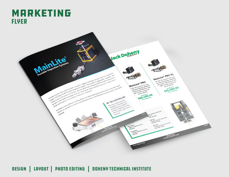
Developed a 2 sided product flyer for print for Jack Doheny Company. Retouched photography by editing image out of background and placing it in a clean and elegant home. Followed brand guidelines while pushing the designs with a modern approach.
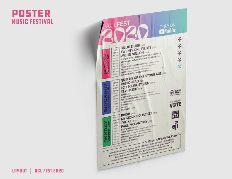
Poster design for ACL Fest 2020. Developed an easy to read, yet trendy design for ACL fest drawing inspiration from current and past trends in the design world.
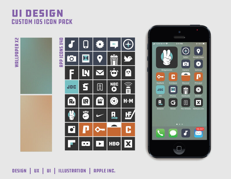
Designed a unified group of app icons and backgrounds for iOS and made available on github. Used color and icons to quickly allow users to know what they need as they open their phone. Orange for banking, blue for native iOS apps, light blue for work, and gray for various other apps.
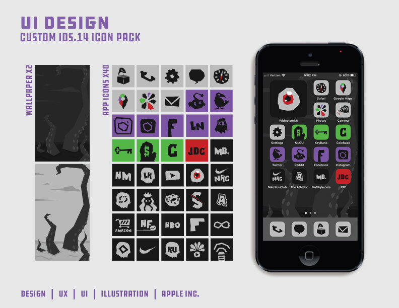
Designed a unified group of spooky themed app icons and backgrounds for iOS and made available on github. Drawing inspiration from graphics on books in the horror genre. Used color and icons to quickly allow users to know what they need as they open their phone. Green for banking, gray for native iOS apps, purple for social media, red for work, and black for various other apps.
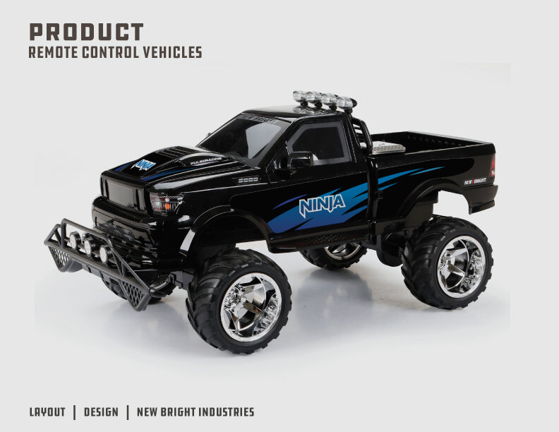
Designed sticker graphics for a remote control monster truck with a ninja theme. Developed a handful of solutions and edited revisions, coming to an accessible solution for the age 9-13 boys group. Created a logo and used hard lines to show an “edginess” while keeping it family friendly.
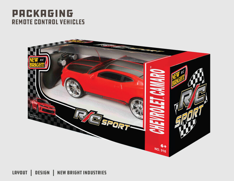
Using a previously created package template with bleeds and trims built in as the base, I brought their aesthetic forward from their previous designs with a more aggressive and modern approach. Using racing themes as my design inspiration while adhering to brand guidelines from both New Bright (Color theme, logo placement) and Chevy (Vehicle font, images).
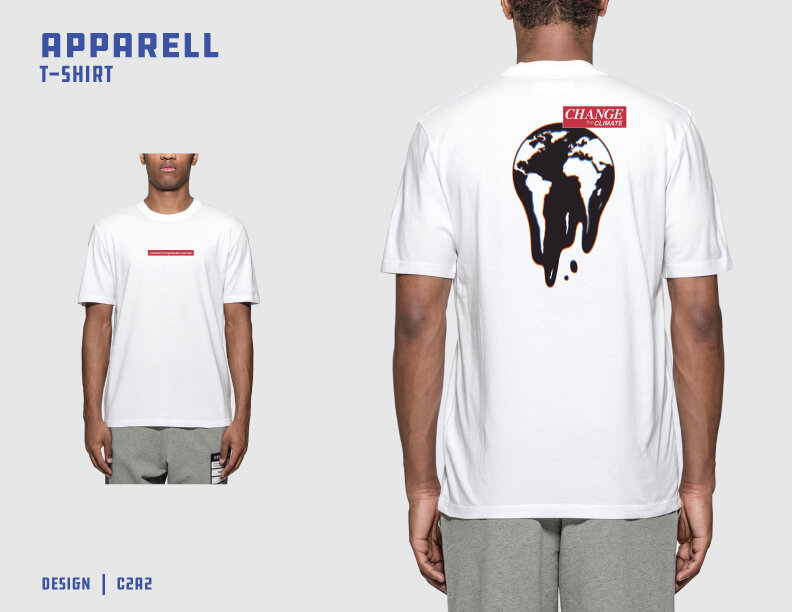
My goal was to create an awareness around global warming. I did a deep dive into all the in’s and out’s of global warming, drawing inspiration more specifically from lost habitats and locations it’s currently having a devastating impact. I used this information and combined that with with current trends in the streetwear industry. Executed from raw sketches all the way through to final, print-ready design.
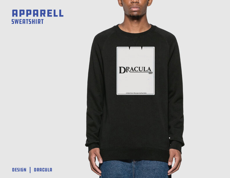
Developed a Dracula themed graphic for spooky (Halloween) season which was used in a campaign for Everpress. Inspired by the original book combined with a some simple yet effective use of negative space.
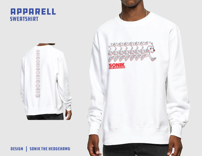
Streetwear being the main inspiration for the layout of these graphics. I drew on the bootleg industry to create an “Off” version of Sonic the Hedgehog.
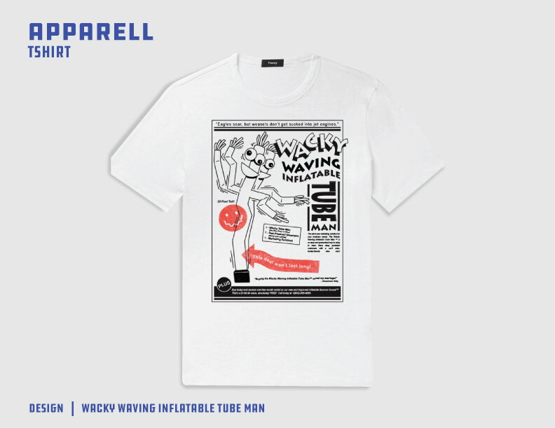
Created a graphic for Wacky Waving Infalttable Tube Man because you can never take yourself too seriously. Graphic layout was inspired by old, 50’s and 60’s newspaper ads.

My goal was to create an awareness around global warming. I did a deep dive into all the in’s and out’s of global warming, drawing inspiration more specifically from lost habitats and locations it’s currently having a devastating impact. I used this information and combined that with with current trends in the streetwear industry. Executed from raw sketches all the way through to final, print-ready design.
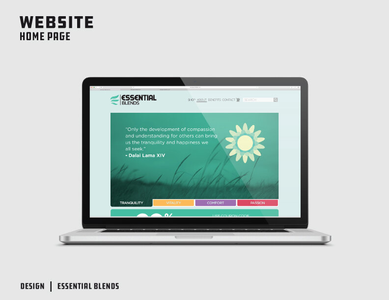
Created a proof of concept page for Essential Blends oils. Used fun, inviting graphics for an approachable webpage while following the 15 second rule of “get where you’re going before consumers leave your page”.
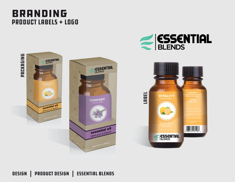
Packaging graphics for Essential Blends, essential oils. Using their branding and bottles, the goal was to create a design that stands out on shelfs while telling you what you need to know as quickly as possible. This was built alongside their website design as a campaign proof of concept.
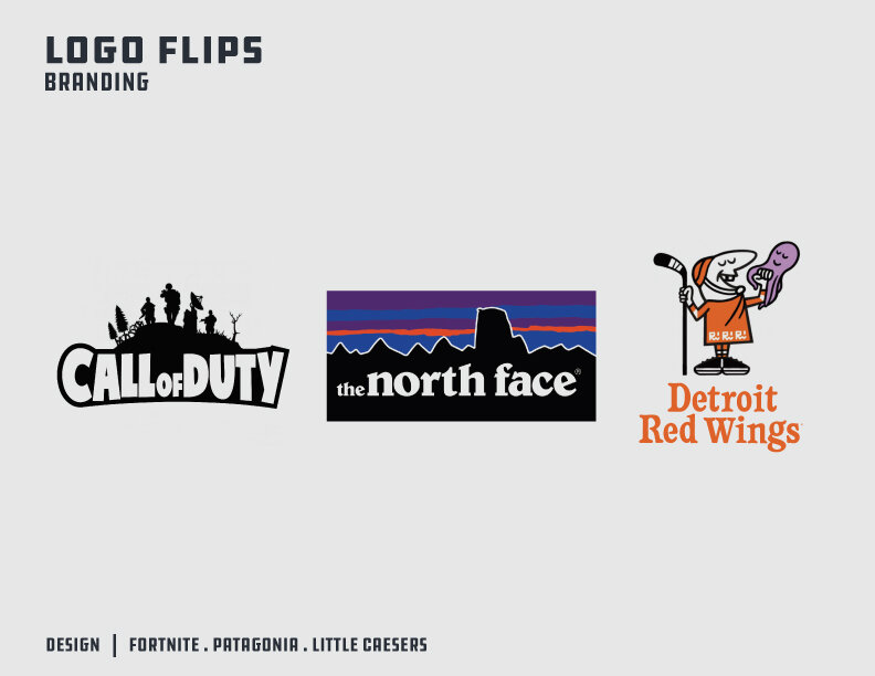
An exercise in creativity and design. The logo flips are as follows: Fortnite - Call of Duty, The North Face - Patagonia, Little Caesers - Detroit Red Wings.
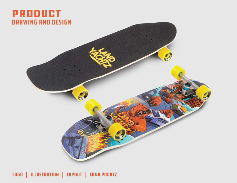
Created an illustration layout for LandYachtz skateboards. Anarchist Bears was the theme. I executed sketches, inking, color, and layout of graphics.